Helping new users find the easiest way to automate
In an automation product, a user who never builds a workflow never sees its value. Most new viaSocket signups were leaving at that first step. I redesigned their landing experience into a dedicated Home page to show them the easiest way to start, and 70% of new signups started building.
Get new signups to build a workflow and make it live
Product designer and researcher
The founder and developers
Existing MUI components only
Where users dropped off
I mapped where new users left. Getting from signup to a running workflow takes four steps, and viaSocket was losing users at all four of them:
- Find a starting point
- Build a workflow
- Make it live
- Keep it running
What do I do? New users didn't know where to start.
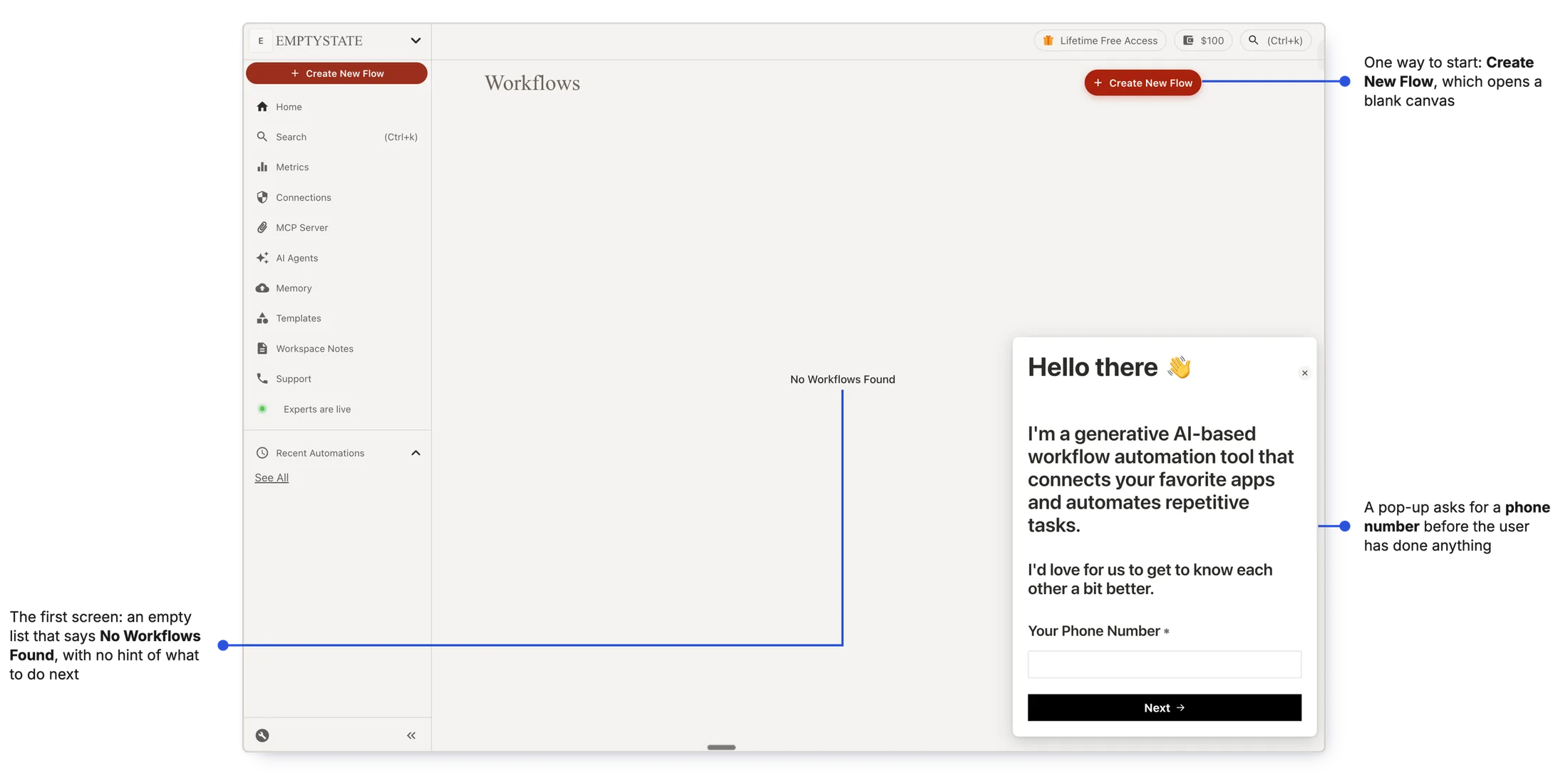
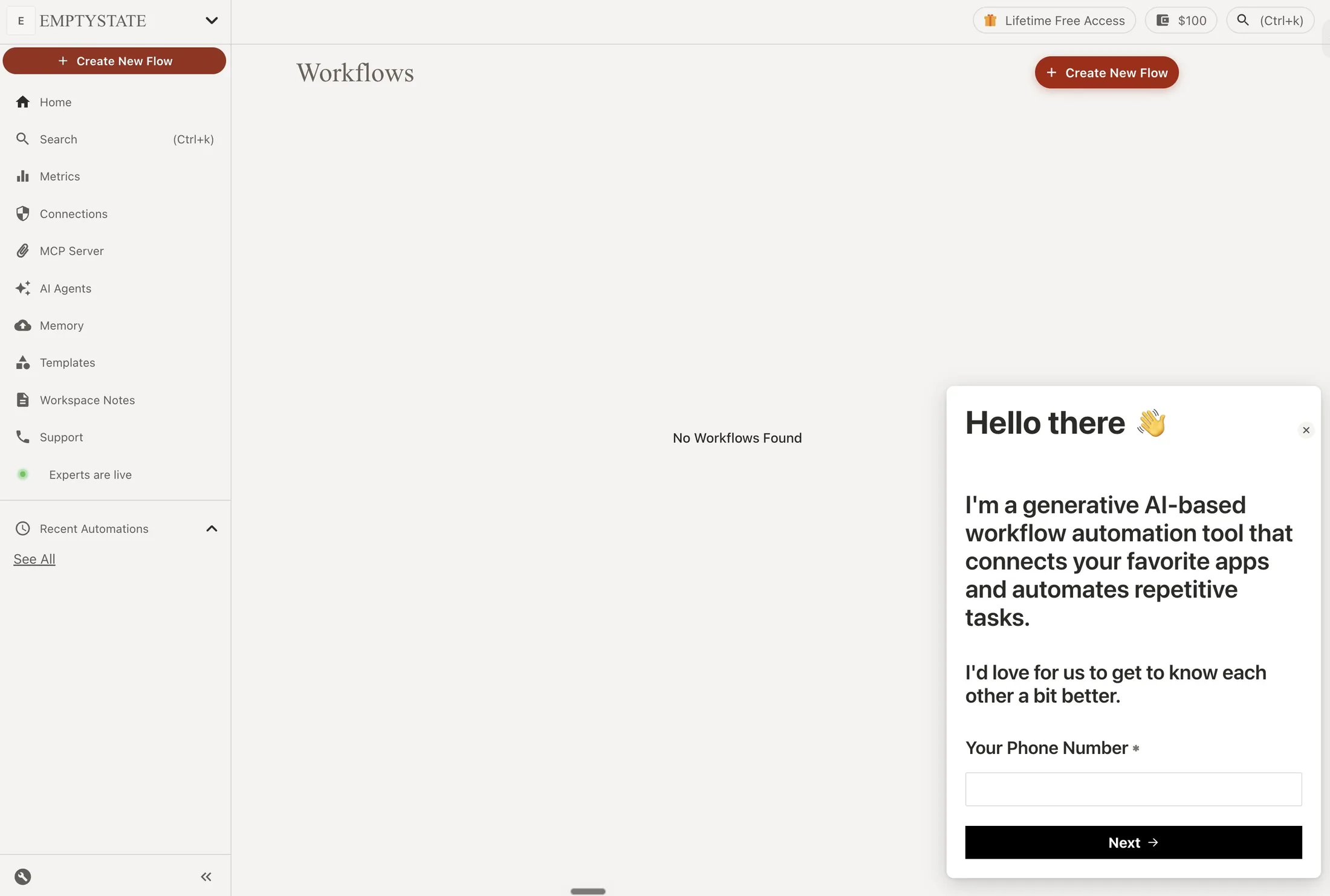
What happened: after signup, users landed on an empty Workflows page. The only obvious way in was Create New Flow, which opened a blank canvas, and most stopped there.
Why: easier ways to create a workflow existed, but users couldn't discover them.
Why it mattered A user who can't take the first step never builds a workflow, and never sees what viaSocket can do.
Starting point
Build a workflow
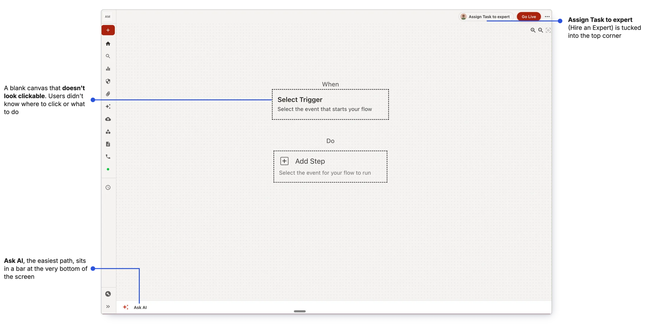
viaSocket had four ways to build a workflow. New users only ever found one.
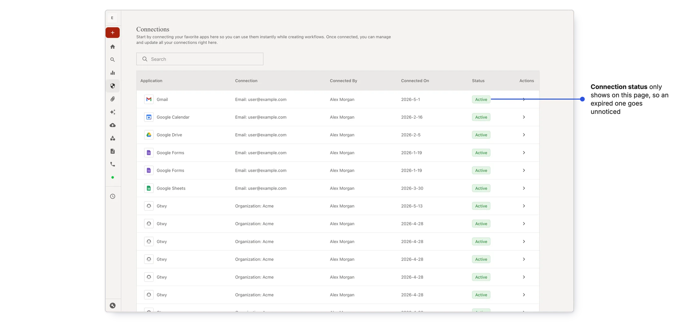
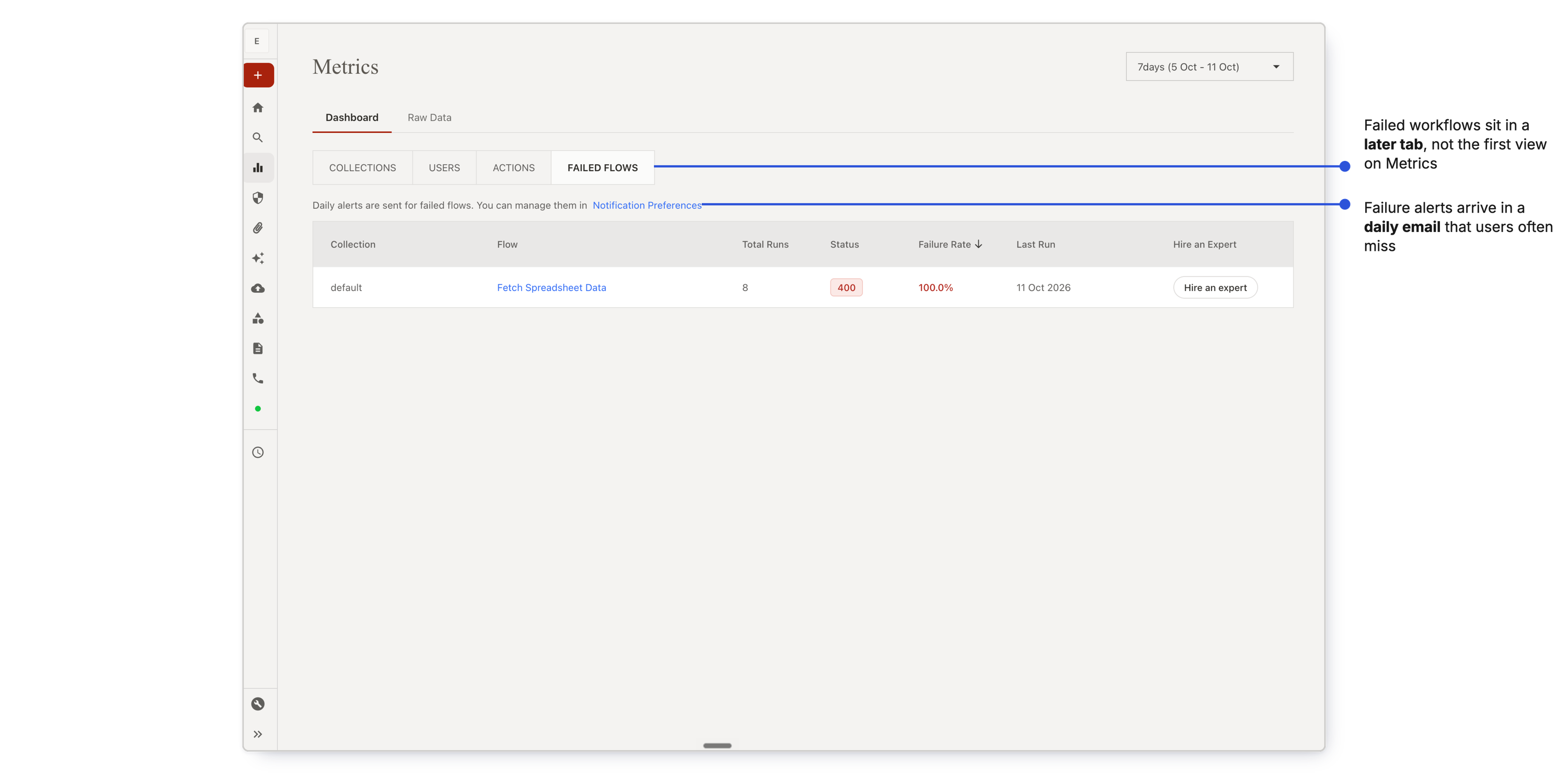
Is everything okay? Active users couldn't see what needed attention.
What happened: viaSocket emailed users when something broke, but most missed those emails. When they logged in, there was nothing up front to act on.
Why: the information was spread across two pages, Connections and Metrics. Users rarely visited them, and didn't know they had to.
Why it mattered For a small business, a workflow is part of how the business runs. A silent failure costs them time, and their trust in viaSocket.
Where do new features go? The product had no room to grow.
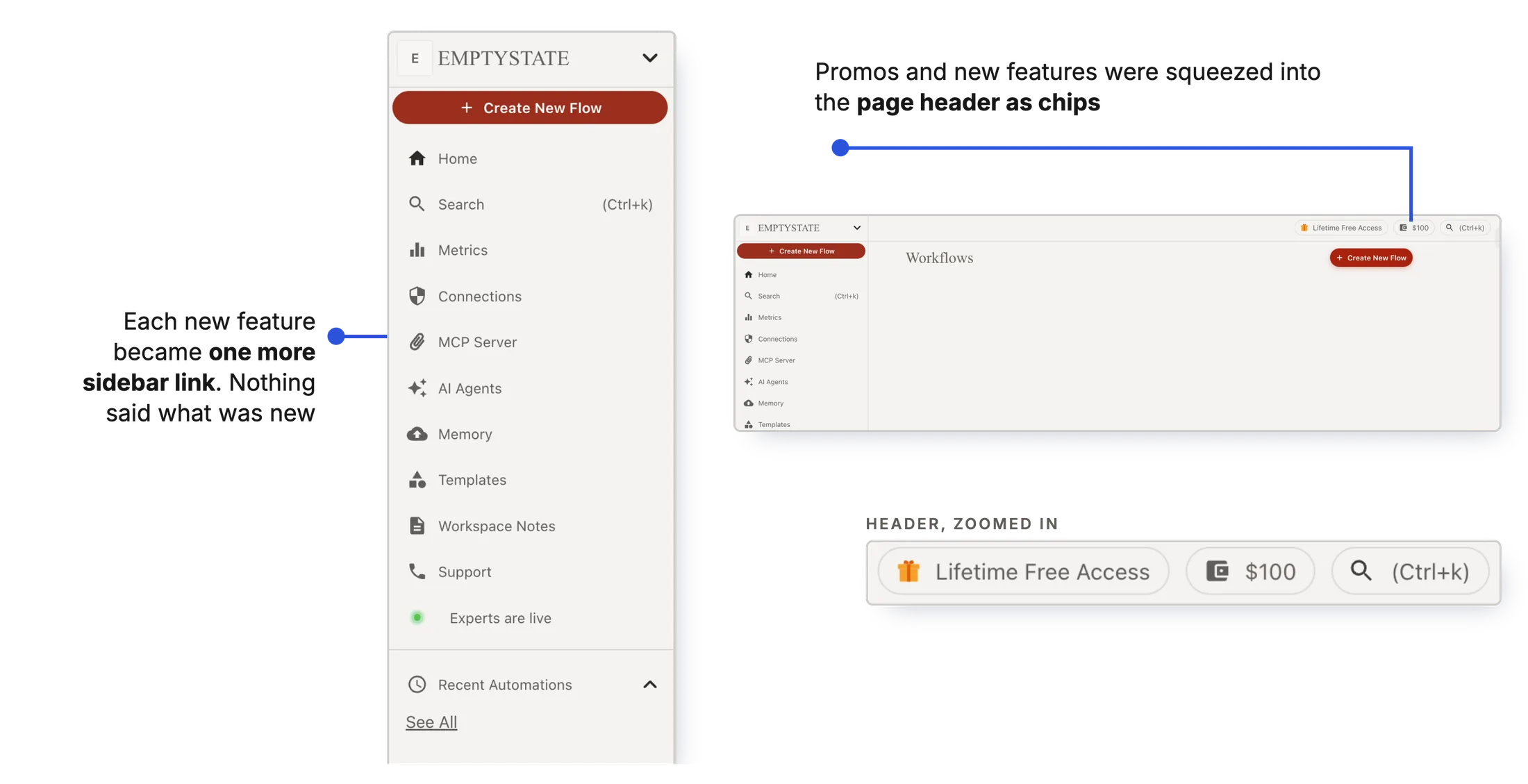
What happened: every new feature landed on the Flows page. With each release it got more crowded, and useful features got harder to find.
Why: the product had no place built for new things, so each feature squeezed into the sidebar or a page header.
Why it mattered Users asked for one place to learn what viaSocket can do. A feature they can't find is a feature they'll never use.
One page had to answer three questions
Open with one question
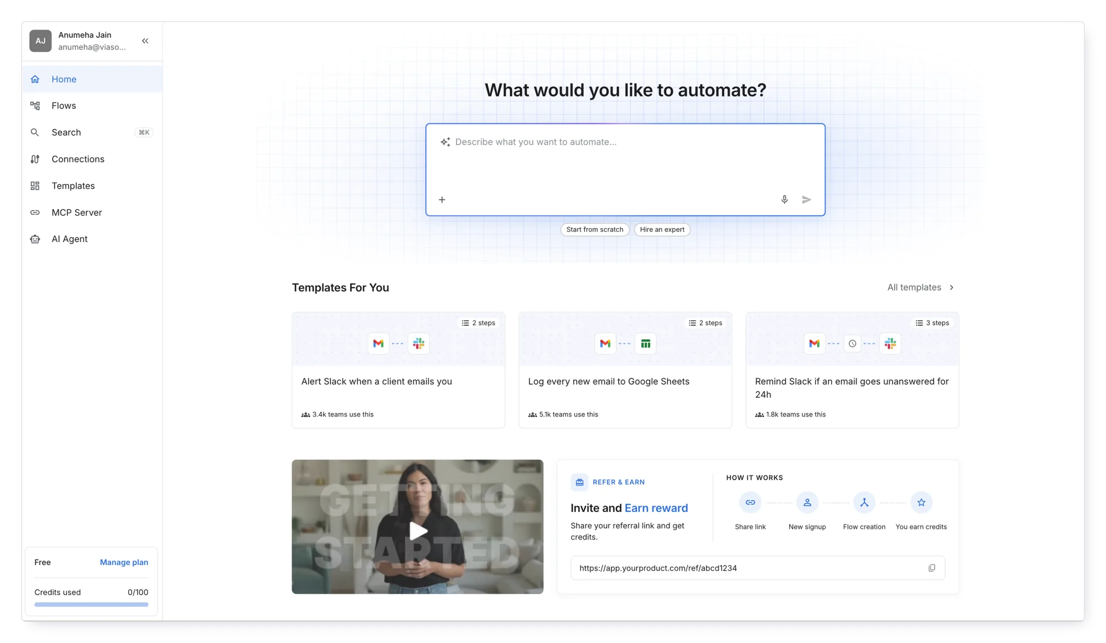
Home opens with one question: "What would you like to automate?" Users describe the task in their own words and AI builds the workflow. Right below sit the other ways to start, with templates matched to the apps they picked during onboarding.
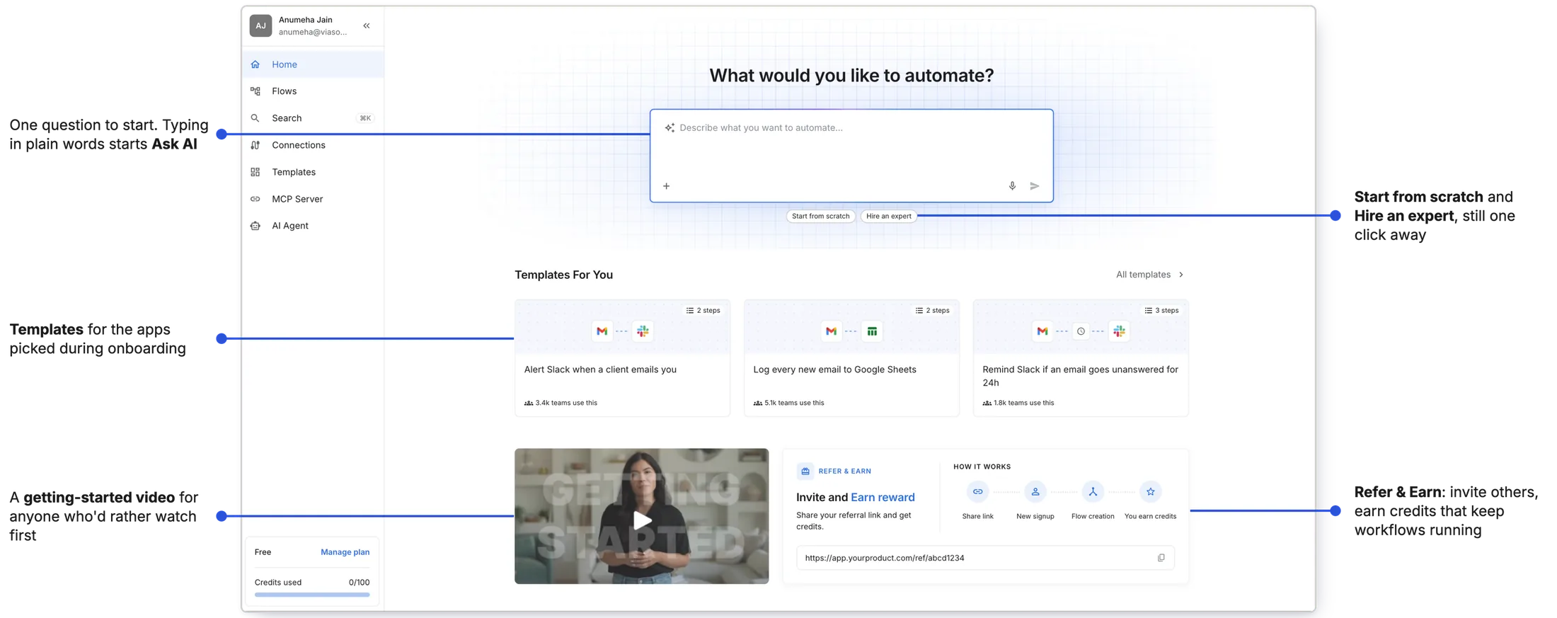
Why AI first Describing a task in plain words takes the least effort, and it was the path users didn't know existed.
Show what needs attention the moment users log in
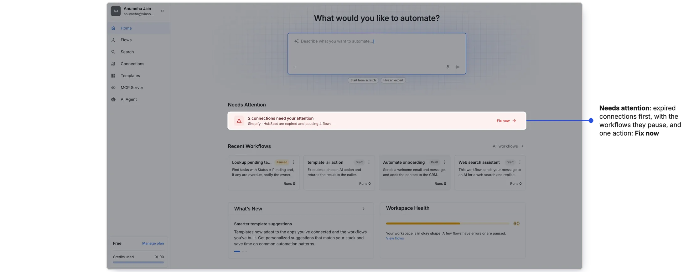
A failure hits at two levels: the workflow and the workspace. Home gives one signal for each, right where users land.
An expired connection quietly stops every workflow that uses it. Home shows it first, with one action: Fix now.
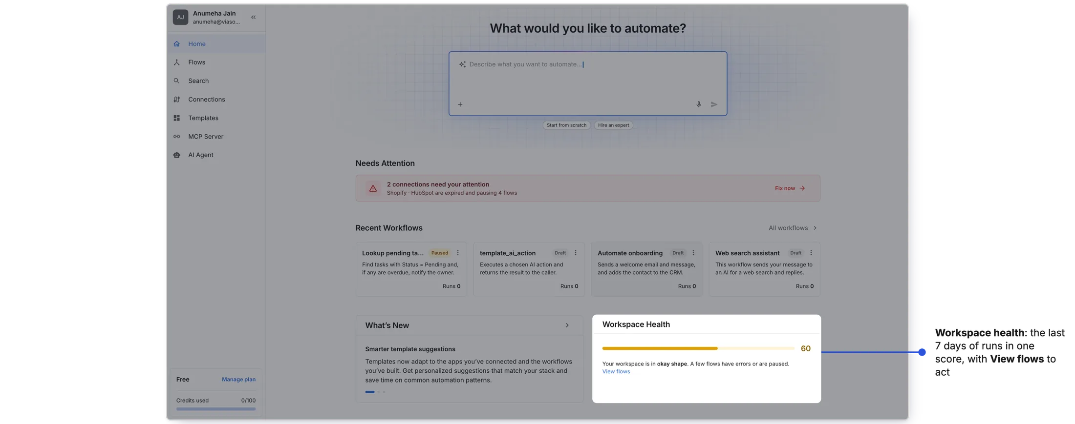
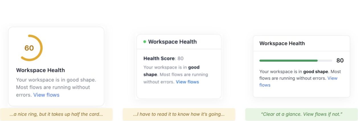
The last 7 days of workflow runs become one score: Good, Average or Bad. A word, not just a number, so users know how worried to be. View Flows opens the failed workflows.
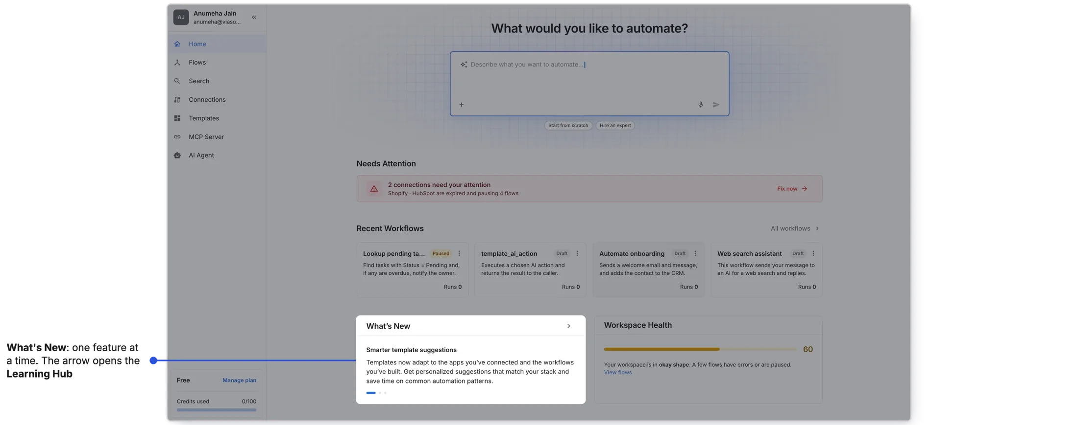
Give new features a place on Home
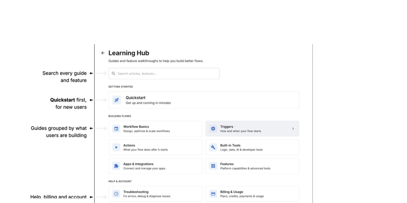
What's New previews one feature at a time; the arrow opens the Learning Hub, where guides are grouped by what users are trying to do.
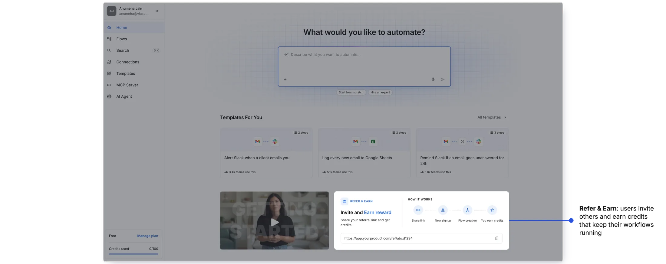
Also on Home: Refer & Earn, for the business
Billing launched in the same period and the business needed a growth lever. Users invite others and earn credits that keep their workflows running.
It worked, and it showed the next gap
In the first month after launch, 70% of new signups started building a workflow and 23% made one live. Active users acted on the expired connections alert on Home.
How I measured: PostHog events, session recordings and product metrics.
Reflection
This project taught me that a product can be full of value and still feel empty. viaSocket had easier ways to build a workflow, ways to spot what had broken, and new features on the way. But there was no central place that brought any of it to users.
My biggest takeaway: discoverability isn't a layer on top of the product. It is the product. By designing one page around three different needs (new users, active users and the product itself), we didn't just add a screen. We built a single place that lets the rest of the product be found.
- Most new signups left before building anything, though easier ways to build already existed.
- I designed viaSocket's dedicated Home page around three questions: what do I do, is everything okay, where do new features go.
- Ask AI first, broken connections up top, workspace health as a word, a home for new features.
- 70% of new signups started building; 23% made one live in the first month.